pie time
I spent some time making time lapse videos of my ink drawings yesterday. It was super fun!
Meanwhile our last sale of the year ends soon! Take 15% off with the code CYWEEK18 in our shop ends Sunday!
I hope you have a great weekend!
I spent some time making time lapse videos of my ink drawings yesterday. It was super fun!
Meanwhile our last sale of the year ends soon! Take 15% off with the code CYWEEK18 in our shop ends Sunday!
I hope you have a great weekend!

I had every intention of completing this drawing of our family dancing. Some of our best days are when the hubbahubba puts on a record and our daughter demands that we get up to dance (mostly to chaiyya chaiyya). Like many things this year, though, I did not have enough time. So I share it in its raw sketchy state as it still captures our joy.
It’s been a strange, exhausting year. Aside from sharing PASHMINA across the country, creatively the best art I shared were my free resistance coloring pages. Most of my other work I cannot share yet. In fact one of my projects, a picture book titled I WILL BE FIERCE was just announced.
For the first time in my years of working independently, I am taking 2 full weeks off for the holidays. Not working late on Christmas eve, not missing catching up with friends and family and taking a much needed mental break.
Thank you for all your support & shares. I hope you have happy, warm holidays.

My most personal comic about eggs and my first pregnancy is on the Nib.
I want to be clear that I am not anti-vegan nor am I making any correlations between protein and pregnancy. I used eggs as a vehicle to share my experience. I needed to make this comic and I needed to make it in a way that didn’t focus on the day of loss but instead on the before and after. For me those are the times that take the longest to process.
Thank you for reading and I hope you have a lovely week.

My theme for inktober is fall favorites. If you have a fall favorite you’d like to see my draw, leave a comment and I may draw it!
One of the things I enjoy the most about the inktober challenge is using color in harmony with the ink. I realized that if I don’t ink the outlines of all the elements (in this case the leaves), I can give the appearance of a foreground and middle ground. That means that the ink can pop forward and the color, even though its everywhere, has a more subtle quality.
SOLD! They measure 2.5×3.5 inches on bristol board made with a combination of brush pen, color markers, microns and a little dash of colerase pencils. I will update the post with sold if they’re gone ^_^
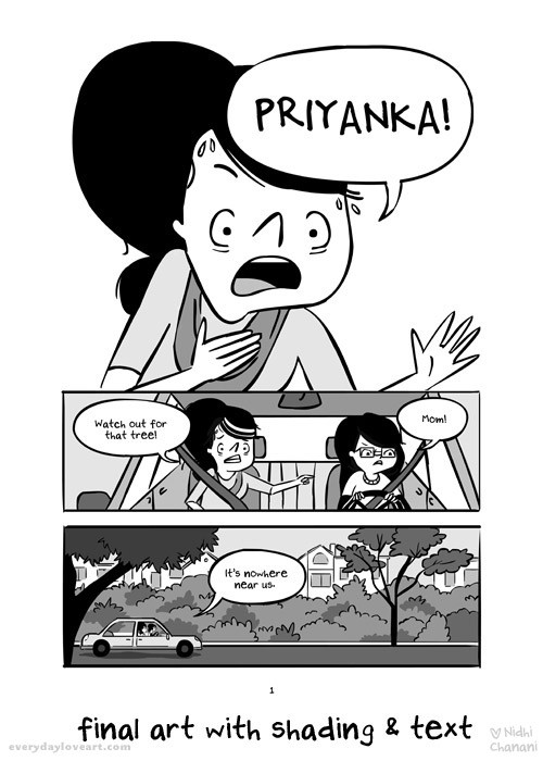
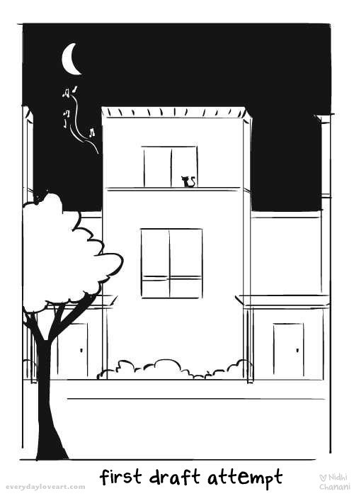 I am working diligently on Pashmina. As I completethe final art, I feel challenged and discover new ways to communicate the story through art andwords. Even at this stage of final art I continue to learn and edit. The evolution of a graphic novel is excruciating but also wonderful. I cannot believe how far I’ve come in what seems like a short time – although I’ve been working on this book for 3 years now. The above page was in thepitch to publishers. Originally page 1 wasan establishing shot of Priyanka’s home.
 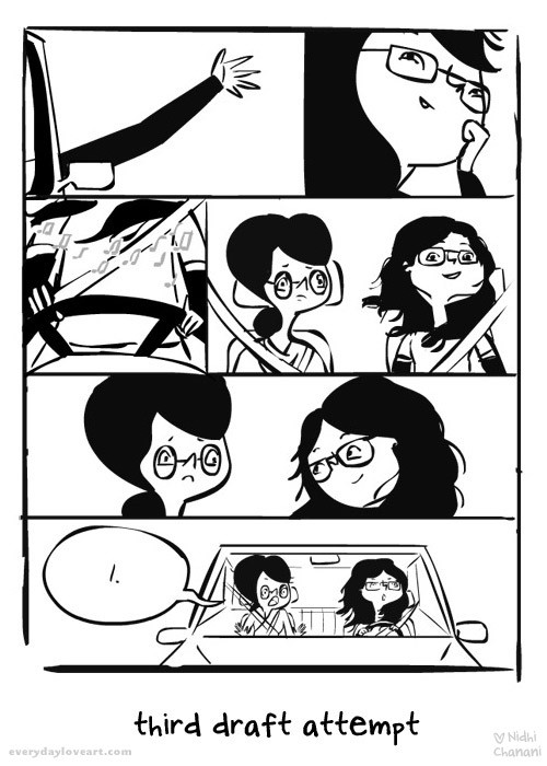 After a few manuscript revisions, page 1 was her school for a brief moment, until I settled on a driving scene. I trieda “soft opening” which includeda series of shots of Priyanka enjoying driving – hand out the car window, wind in her hair, listening to music. I wanted to contrast her feelings of freedomwith her worried mother and end it with her mom yelling, “PRIYANKA”.
 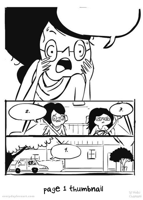 After one of many long conversations with my editor he made the comment that it’s better to start with action. I thought about that and shifted the panels. I began with her mom yelling and it felt right. Instead of an establishing shot, a soft flowing opening, we dive into STORY and their relationship. My editor suggested that I think about how my characters hands can look more natural, and to act out what my characters are doing. For months during the thumbnail process I would walk around our apartment saying lines and acting. Nick would giggle at me as I repeated some lines over and over trying to put myself mentally in the moment. While working on the story and revisionsI was thinking about Pashmina so much that it felt like Priyanka and her family wereliving with us. And in many ways, they still are.
 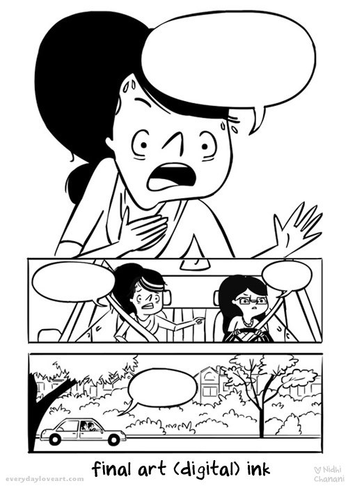 Finally I settled on the right hand placement and after thumbnailing the entire book for roughly a year (which included many revisions small and large) I started on final art earlier this year. As I looked back on the pitches, I thought, “Wow! So much goes into just one page!” I’ve always wanted to make a graphic novel but I never realized the amount of work it takes to visually communicate a long form story. From panelling, character design and acting to story development, line work and shading (and color!) it exercisesevery creative muscle – and I love it more and more every day!

I had the pleasure of working with a loving couple on a commission recently, V & P. The process was wonderful from beginning to end and with their permission, I wanted to share a bit about my process in creating an illustration.
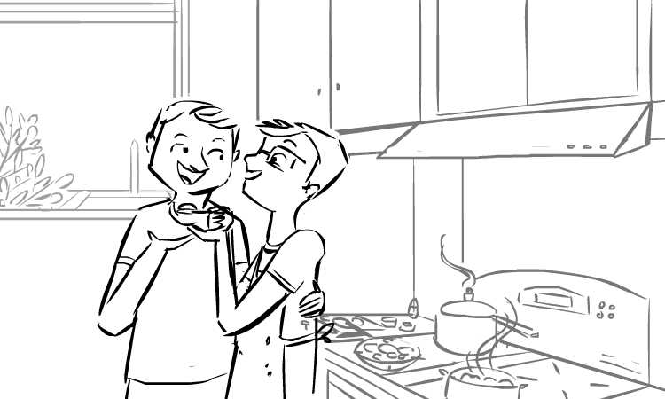
At the beginning of the commission, I asked V & P to send me some reference photos – I can’t draw them without knowing what they look like ^_^ I also asked them if they had ideas of what they wanted me to draw and if they had favorites from my portfolio. Asking people about their favorites gives me a good idea of the colors, stories and emotions they are looking for… They sent all the requested information as well as a bit about themselves – this included a video that V had made for P on their first anniversary. I thought, okay, I’ll watch it for some more reference on their faces but focus on what they want. They indicated they were interested in a scene in their kitchen cooking together with the Washington Monument in the background (to indicate location). So I drew this:
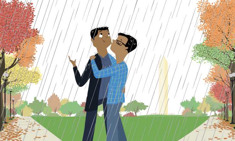
But when I watched the video… it was as if V & P were right there with me. Telling me stories about how they met, fell in love and I truly felt as though I knew them. One story in particular stood out, on their first date it began to rain as they were walking which they compared to a bollywood film… Immediately this image popped into my head:
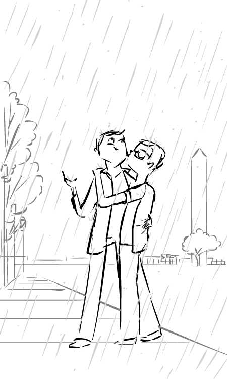
Generally with commissions I try to provide two distinct sketches in two different orientations. But the second sketch wasn’t one they asked for… I wasn’t sure they would like it. It seemed too simple. One of the things that is difficult to convey with a line drawing or sketch is what the transition from the above drawing to the final piece will be… I can see it in my head, but I do this every day! ^_^ I was hopeful that from this basic drawing they could tell where I would end up…
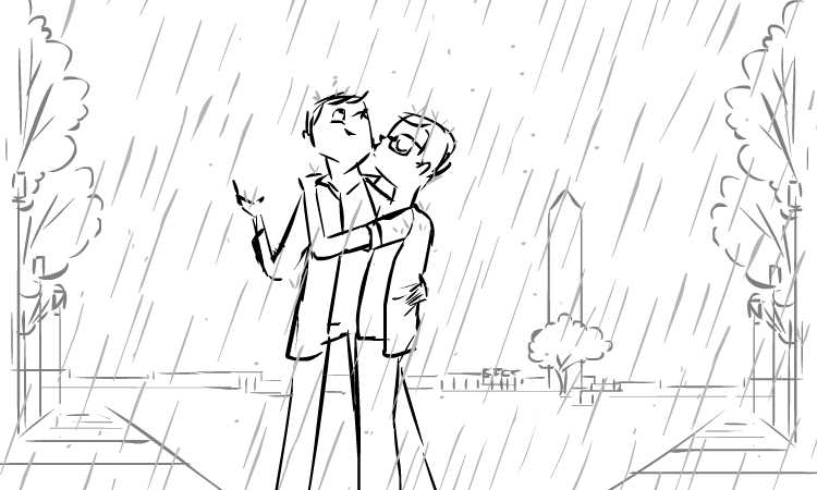
And they could tell! They picked that sketch and V & P only asked me to change the orientation, and indicate that it was fall time – my sketch was approved! Here is the revised sketch:
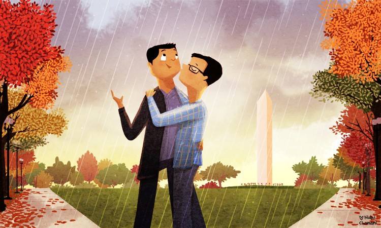
My illustration work is all digital, so these sketches were created in flash. Once the sketch is approved, I lock the line drawing layers and begin to draw in color over them. I spent a lot of time on the trees, drawing each leaf in the foreground, getting the fall colors right. Because I am drawing for someone else (as opposed to drawing for myself) I take this part slower than normal. I researched reference for the Washington Monument, fall trees in DC, and I watched V & P’s video a few more times (partly for reference and partly because it inspired me ^_^).
This is something I never show, but here is my full color drawing before I take it into Photoshop.
I often feel that the work I do in Flash is the “hard” work, and the work in photoshop is fun. In the drawing above, you get the idea of the colors, but none of the light, texture, or vibrancy that comes when I work in Photoshop.
I finished the color work in Flash one day and the next day I began to paint in Photoshop. I ended up with over 98 layers – which is more than I have for most drawings. I knew I wanted the sky to have a somewhat thunderstorm-y feel, but I also wanted to have a bright light come from behind the monument. Everything else I painted, added texture, light and shadow intuitively. When you look at the illustration it’s just trees, rain and a couple… but simplicity is deceptive. From the shadows on the sidewalk, to the texture of the grass, each piece, each layer, breathes life into the illustration. The longer I worked on it, the more I feel in love with it.
It’s always nerve-wracking when I feel happy with my work but I’m not sure what the receiving party will think. After all, we haven’t met. We exchanged maybe 20 emails over the course of the commission and in the end I wanted to ensure that V & P loved it like I did.
Lucky for me, they did. And in the end, I feel like they have given me a gift. A chance to peek into their life, understand and be inspired by their love and create a new relationship where there was none.
Art brought us together… and I love that.
i’ve had a lot of people ask how i make my images and if i do commissions (yes, i do!) so i thought i would share my process.
a bit ago, a client contacted me to create an image of her and her hubby for their first wedding anniversary. so cute! i love those kinds of jobs and i felt very honored to be a part of their special day. she gave me some direction – their honeymoon to greece, them walking together, and sent me a bunch of photos. we agreed on a price, which included a couple rounds of revisions and i sent off preliminary drawings.

after i sent these to her, she told me what she liked – the look between them in the first, the composition of the third, except it felt unbalanced on the left. oh, and that she wanted her black boots (hehe) and i had put a cat in her hubby’s bag (third), but they actually have a dog! i revised the sketches and sent her the following sketch.

this made her very happy so there was only one revision.
from here i took my line drawing and in flash added a layer over it and went in with color. i don’t usually have any specific color in mind, i am fairly intuitive with colors. after looking at her photos, i knew the kinds of outfits both of them wore and i generally tried to pick colors that would unify them and the entire piece.

after this, i take the drawing into photoshop. i add highlights, gradients and this is where i spend time playing with overlays of color and really finalizing the image.

and voila! she was very happy and so was i! ^_^