Posts
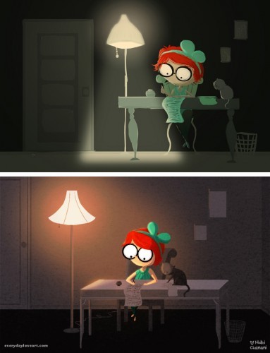
lamp lights
/4 Comments/in creative process, daily drawing /by Nidhi ChananiFall into me (process post)
/25 Comments/in creative process, daily drawing /by Nidhi ChananiI had the pleasure of working with a loving couple on a commission recently, V & P. The process was wonderful from beginning to end and with their permission, I wanted to share a bit about my process in creating an illustration.
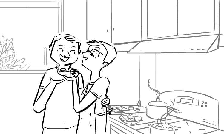
At the beginning of the commission, I asked V & P to send me some reference photos – I can’t draw them without knowing what they look like ^_^ I also asked them if they had ideas of what they wanted me to draw and if they had favorites from my portfolio. Asking people about their favorites gives me a good idea of the colors, stories and emotions they are looking for… They sent all the requested information as well as a bit about themselves – this included a video that V had made for P on their first anniversary. I thought, okay, I’ll watch it for some more reference on their faces but focus on what they want. They indicated they were interested in a scene in their kitchen cooking together with the Washington Monument in the background (to indicate location). So I drew this:
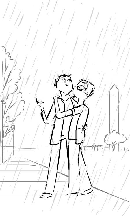
But when I watched the video… it was as if V & P were right there with me. Telling me stories about how they met, fell in love and I truly felt as though I knew them. One story in particular stood out, on their first date it began to rain as they were walking which they compared to a bollywood film… Immediately this image popped into my head:
Generally with commissions I try to provide two distinct sketches in two different orientations. But the second sketch wasn’t one they asked for… I wasn’t sure they would like it. It seemed too simple. One of the things that is difficult to convey with a line drawing or sketch is what the transition from the above drawing to the final piece will be… I can see it in my head, but I do this every day! ^_^ I was hopeful that from this basic drawing they could tell where I would end up…
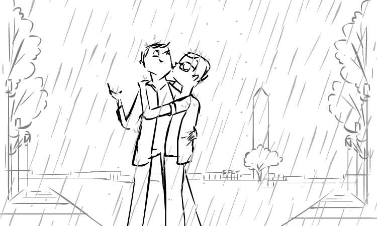
And they could tell! They picked that sketch and V & P only asked me to change the orientation, and indicate that it was fall time – my sketch was approved! Here is the revised sketch:
My illustration work is all digital, so these sketches were created in flash. Once the sketch is approved, I lock the line drawing layers and begin to draw in color over them. I spent a lot of time on the trees, drawing each leaf in the foreground, getting the fall colors right. Because I am drawing for someone else (as opposed to drawing for myself) I take this part slower than normal. I researched reference for the Washington Monument, fall trees in DC, and I watched V & P’s video a few more times (partly for reference and partly because it inspired me ^_^).
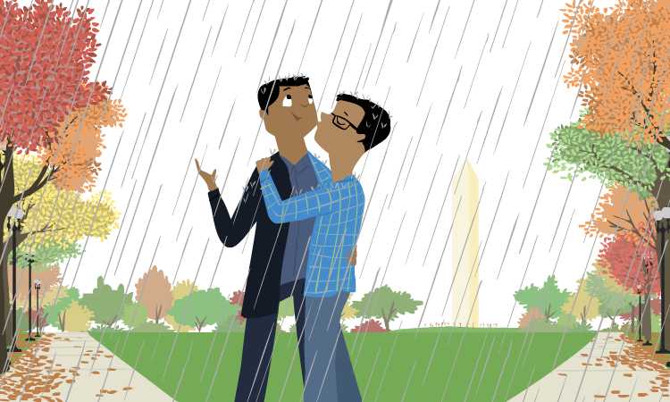
This is something I never show, but here is my full color drawing before I take it into Photoshop.
I often feel that the work I do in Flash is the “hard” work, and the work in photoshop is fun. In the drawing above, you get the idea of the colors, but none of the light, texture, or vibrancy that comes when I work in Photoshop.
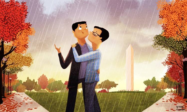
I finished the color work in Flash one day and the next day I began to paint in Photoshop. I ended up with over 98 layers – which is more than I have for most drawings. I knew I wanted the sky to have a somewhat thunderstorm-y feel, but I also wanted to have a bright light come from behind the monument. Everything else I painted, added texture, light and shadow intuitively. When you look at the illustration it’s just trees, rain and a couple… but simplicity is deceptive. From the shadows on the sidewalk, to the texture of the grass, each piece, each layer, breathes life into the illustration. The longer I worked on it, the more I feel in love with it.
It’s always nerve-wracking when I feel happy with my work but I’m not sure what the receiving party will think. After all, we haven’t met. We exchanged maybe 20 emails over the course of the commission and in the end I wanted to ensure that V & P loved it like I did.
Lucky for me, they did. And in the end, I feel like they have given me a gift. A chance to peek into their life, understand and be inspired by their love and create a new relationship where there was none.
Art brought us together… and I love that.
